
 |
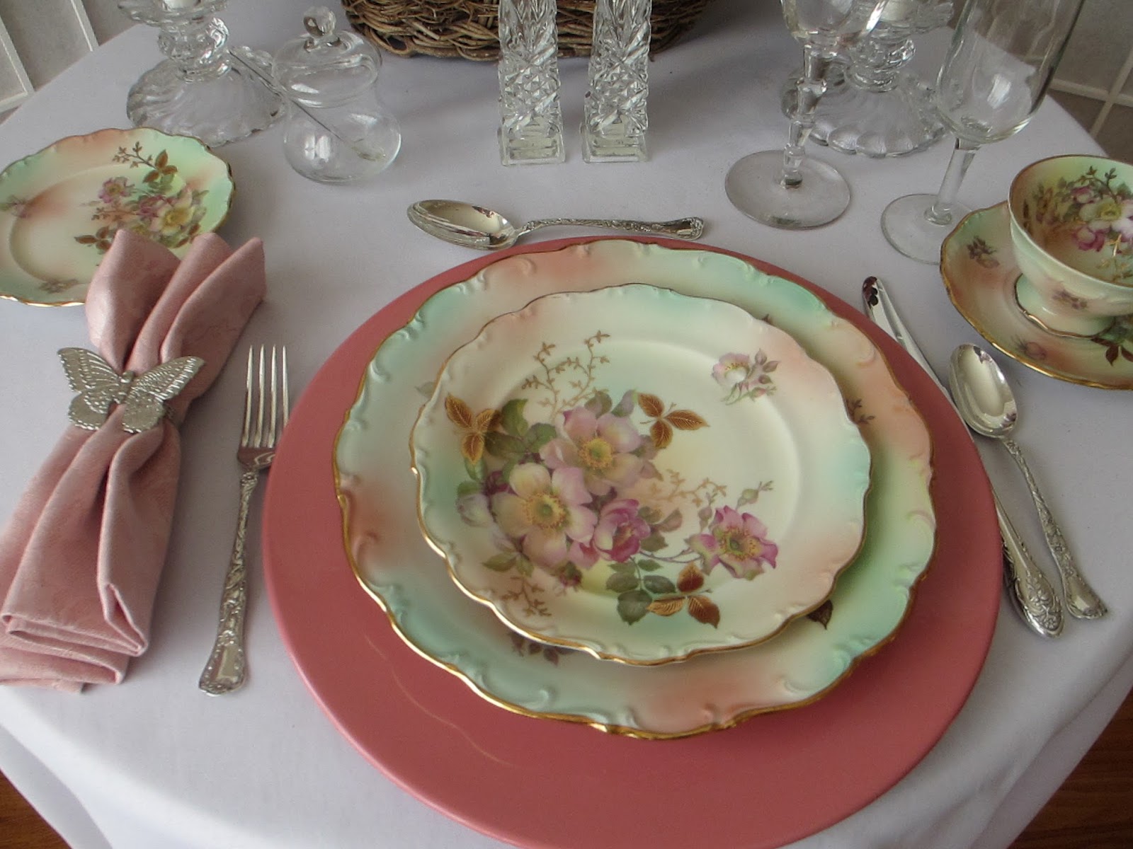
The dinnerware pattern is "Gainsborough" by Spode
|


 |
The charger is actually a beautiful dusty rose (but it was dark and pouring down rain when I took the picture).
|


Charger - "Rose Blush" Color Spectrum by Mikasa from eBay
Dinnerware - "Gainsborough" by Spode from our collection
Flatware - "Marguerite" by Gorham from Pat's husband
Dusty Rose Damask Napkin - from Gottschalk's (a local department store now our of business)
Silver Napkin Ring - from Tuesday Morning two or three years ago
Water Goblet - Pattern unknown but it was a gift from a friend
Champagne Glass - from the Dollar Store
Candle Holders - from Art & Old Things (a local antique store)
Jam/Honey Jar - from Princess House years ago
Here's a few sample settings that go well with the color theme:
 |
The pattern is "Rose Chintz" by Johnson Brothers
|

 |
The pattern is "Wild Rose" by Schumann
|
 |
The pattern is "Versailles" by Lenox
|

 |
The pattern is "Pembroke" by Aynsley
|

 |
The pattern is "Tower" by Spode
|

 |
The pattern is "The Lombardy" by Johnson Brothers
|

"Dishing It! & Digging It!" at Rustic & Refined this Sunday: http://www.rustic-refined.com/
"Tablescape Thursday" at Between Naps on the Porch: http://betweennapsontheporch.net
It is fascinating to see the many different patterns that are all perfect for this scheme! I love the Spode Gainsborough. I own just 3 salad plates in the similar pattern Spode 'Reynolds'--people notice one plate quietly displayed on my bookcase. Old Spode is so interesting, deep, and the colors are like nothing else. One of my treasured possessions is my set of Spode Blue Bird. I thoroughly enjoyed these tables!--Your Hoosier friend, Tina Reynolds
ReplyDeleteGorgeous color. The pale pale pink looks like Pantone's color this year. Very popular! But since pink is kind of close to purple, I love the color.
ReplyDeleteLoved seeing how you used it :-)
Beautiful - all of them!
ReplyDeleteEach combination looks beautiful, I like the way you showed several different setting.
ReplyDelete